How to choose a font
If you’re like me, you may have read hundreds of books, without ever giving a second thought to the font that all that text was set in. But as a self-published author, you have to choose that font. Which turns out to be surprisingly hard!
For many of us, our main exposure to font choices is the little drop-down box in Microsoft Word:

In my copy of Word, there are more than 400 fonts in there! And almost all of them were a mystery to me. Before I published a book, probably the only three fonts I could even name were Helvetica, Times New Roman, and Comic Sans.

Arguably, none of these fonts looks right to use in the body text of a fiction book. But why not? And how do you pick one that does look right? What does it even mean for a font to “look right” in a book?
We can generally say that title or logo fonts (the more decorative ones like Trade Gothic Inline in the Word list above) would never be used to set the main text of a book, since they’d be too hard to read. But that still leaves hundreds of body fonts to choose from.
Can’t I just pick the default?
When typing my book in manuscript form, I used Times New Roman. All the advice I found online about what font to use in a manuscript that you’d send off to editors and agents said to use this absolutely standard font, to avoid distracting professional readers with irrelevant stylistic choices at that point in the book’s development.
When my book designers first set the text of my book, they used Times New Roman too, and I was so used to seeing it that initially I didn’t give it a second thought. But once I started looking at page proofs, they didn’t seem to have the same feel as a normal, published science-fiction book. Take a look at the first page of my book, with Times New Roman on the left and Adobe Garamond on the right:

The two fonts are supposed to be the same size, but Times looks bigger somehow, as if the letters are taking up more space. And the lines at the ends of paragraphs are shorter, like Garamond can fit more words per line. Maybe Garamond really is just smaller overall? Let’s look at two snippets, with Times on top and Garamond on the bottom:

Hmm. Times is definitely wider, but it’s hard to tell about the height. Let’s overlay them directly, with Times faded out.

Okay, now we can confirm that the fonts are indeed pretty much the same height. But Times’ letters are individually wider, and the loops in the letters are “bubblier”. This is why Times seems to look bigger and more tightly packed on the page, even with the same font height.
There’s nothing wrong with Times, per se. It’s a great font! It just doesn’t have the same look as whatever they’re using in the average sci-fi and fantasy books I read. Times was originally designed to be set in narrow columns in a newspaper, so when you see a page of wide lines, it just seems off.
What is everyone else using?
So at this point, I have a gut feeling that Times doesn’t look right, but I have nothing objective to back that up with. I chose Garamond to compare to above, but how did I know to choose that? What fonts do major sci-fi and fantasy book publishers use?
It turns out that’s not an easy question to answer! Some books include a colophon that tells you what font they used, and who created it. Here’s an example from Assassin’s Fate by Robin Hobb (Del Rey, 2017):

But the vast majority of books don’t have a colophon like this, so we’re usually out of luck. If you look around online, you can find a few folks telling you what they think the most common fonts are for published books. But they don’t typically offer any documentary evidence. And what if it varies by genre?
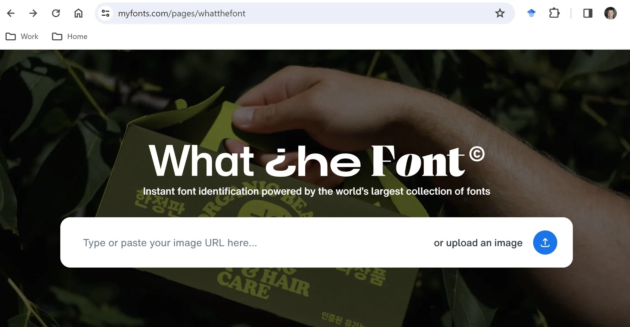
Even if you have a book right in front of you, identifying what font it uses by eyeball alone is very tricky. Maybe an industry expert could totally nail it, like James Bond identifying wine vintages to impress the bad guy in a movie. Unfortunately, I’m not any kind of expert, I’m just some guy who wanted to write a book. But it turns out that modern technology has a solution for me: Monotype’s font identifier at https://www.myfonts.com/pages/whatthefont.
You start with a scanned bit of text from a book, like this one from Arkady Martine’s A Desolation Called Peace (Tor, 2021, p. 265):

If the book’s font has any especially distinctive letters, make sure your scanned snippet includes them (for example, the italic lower-case “k” above in “know” has a distinctive top loop). Make sure to include both normal and italic text in your snippet, as well as punctuation like quotes and question marks, which are often distinctive too. Scan-quality-wise, 300 DPI seems sufficient. I tried up to 1200 DPI just out of curiosity, but it didn’t seem to increase the accuracy of the identification.
When you upload the scanned image, pick a good line of the text to highlight. The tool doesn’t seem to work as well if you highlight multiple lines:

When you click “Identify font”, you’ll get a list of results like this:

Monotype Dante eText is top of the list, so we’re done, right? Well, not quite.
The identification is usually pretty close, but it can miss little details. If you click “Get this font” for a result font, it’ll take you to a page where you can type sample text and see it in that font. You’ll need to type the text in a word processor and paste it into the web page if you want to get smart quotes that match those in a printed book. When I try it out on the text “Then I’d know you were”, I get this:

which is subtly incorrect. The italic lowercase “w” is missing the downward hook on the top middle stroke. It turns out the correct font is Monotype Dante (not eText), which makes sense, because the eText variant is supposed to be for e-readers instead of print. Check it out:

It’s a match!
Sometimes this last step takes some trial and error, but eventually you’ll find the right font. The only exception I’ve found is when you try this for older books, which were printed in the pre-digital era. In that case, you probably won’t find an exact match, since the books were printed with type that’s not available online.
Time for some fiddly work
Now that we know how to reliably identify fonts from printed books, we just have to do a lot of fiddly work. I pulled 14 recently published sci-fi and fantasy books from my shelf, scanned a chunk of likely-looking text from each of them, and went through the process above 14 times. Here are the results:
Adobe Garamond: The Trouble With Peace by Joe Abercrombie (Orbit, 2020)
Adobe Garamond: A Prayer for the Crown-Shy by Becky Chambers (Tordotcom, 2022)
Adobe Garamond: The Wisdom of Crowds by Joe Abercrombie (Orbit, 2021)
Bitstream Original Garamond: Tiamat’s Wrath by James S. A. Corey (Orbit, 2019)
Monotype Dante: A Desolation Called Peace by Arkady Martine (Tor, 2021)
Monotype Dante: The World We Make by N.K. Jemisin (Orbit, 2022)
Monotype Fournier: Half a King by Joe Abercrombie (Del Rey, 2014)
LTC Goudy Oldstyle: Fool’s Quest by Robin Hobb (Del Rey, 2016)
Adobe Warnock: Harrow the Ninth by Tamsyn Muir (Tordotcom, 2020)
Monotype Albertina: Project Hail Mary by Andy Weir (Ballantine Books, 2021)
Monotype Apollo: Skyward by Brandon Sanderson (Delacorte, 2018)
Bitstream Transitional 551: Aurora Rising by Amie Kaufman and Jay Kristoff (Knopf, 2019)
Adobe Caslon: Babel by R.F. Kuang (Harper Voyager, 2022)
URW Janson: Loki’s Ring by Stina Leicht (Saga Press 2023)
You can see that four of the 14 are Garamond, which is why I picked it for my comparison at the beginning of this article. Conspicuously missing is Times New Roman, which wasn’t used in any of these books, or in any other book I found when spot-checking my shelves.
But what do the rest of these fonts look like? To be fair, we should at least check to see if any of them are similar to Times. Here’s a comparison, with Times added at the bottom:

We can see that Times is the second-longest of the fonts, left-to-right, though LTC Goudy Oldstyle is even longer. So at least occasionally, long fonts are used in big-publisher sci-fi and fantasy.
But remember that colophon I showed you earlier? It was for Goudy Oldstyle, for the same Robin Hobb book I sampled above. You’ve gotta figure that when a book designer calls out their font in a colophon, they’re pretty proud of it, and they think they’ve made an idiosyncratic choice. So this kind of long and bubbly font is probably an outlier.
One reason could be that condensed fonts reduce the page counts of long books. Changing my book from Times to Garamond shrank it from 538 to 514 pages. It also makes the last lines of paragraphs shorter, since the lack of right-justification on those lines allows minimal word spacing. This makes paragraphs look more separate, so your eye can track from one to the other more easily.
Another reason that Times sticks out here is the size and prominence of its quotation marks and apostrophes. The lobes at the top are unusually big and round! They stand out, which is probably perfect in a newspaper, where you want the quotes to pop. But books are full of quoted dialog, so these blobby marks pepper the page in a distracting way.
Finally, Times’ italic font is not that different from the regular font. This is a little subjective, but if you look down the list, most of the fonts have an italic that’s more distinct from the regular. For many kinds of books this might not matter, but in sci-fi and fantasy, there’s often a lot of internal narration, which is easier to read if it’s set off in distinctive italics.
The principle of least surprise
Doing this kind of font analysis might give you different results if you did it in some other genre, like romance or non-fiction. The point is this: whatever kind of book you’ve written, you should probably pick a font that won’t surprise or distract your readers, given what they’re accustomed to seeing in similar books.
In self-publishing, there are dozens of ways to accidentally make your book look different from what readers expect. For example, a self-published sci-fi author might not know that cream-colored paper is the standard instead of white, or that the author name goes in the left header and the book title in the right header on a two-page spread, instead of the other way around. These little differences can add up to an off-putting impression, and your book might end up languishing on the bookstore shelf instead of getting picked up.
Finally: don’t screw it up
One final caution from my own experience: decide on your font before the book designers lay out the book! Otherwise, you may be paying extra for them to do it again.
As an inexperienced writer, I wasn’t even really aware that the font was something I had to choose. That sounds crazy to me now, but it just wasn’t on my mental radar. So I didn’t know to check the conventions of my genre until after it was too late. I really should stop being surprised by how much of the publication process that I can be ignorant of!
I also didn’t realize how much manual effort is required on the book designer’s part to do the text layout. Changing the font is definitely not a matter of simply doing a select-all and picking a new font name from the drop-down! It changes tons of stuff, scattered all over the book. They may have to fix the text flow around your chapter initial caps, redo any manual spacing fixes that improved the look of problem lines, and re-place chapter ending graphics that now fall on a different part of the page. Once I realized how much extra work my mistake had caused for the designers, I paid up gladly. But next time, I’ll know better!